Best Paint Colors and Wallpaper Ideas for Every Room in Your Home
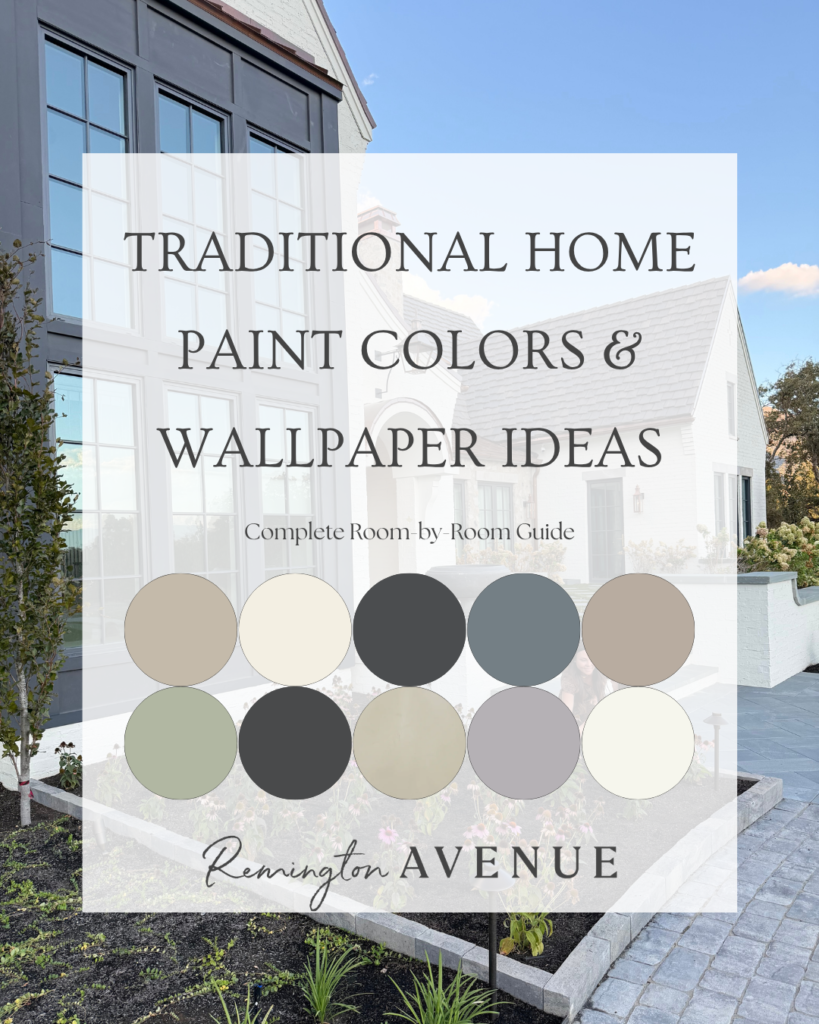
I get asked frequently ‘what paint color is where’ and ‘why would I choose that wallpaper for that space’. So I went on a deep dive, and I am sharing my overall best paint colors and wallpaper ideas for every room in your home. These are the colors, styles and brands I have used throughout my home.
Choosing the right tone and hue for each room is key to creating a welcoming, cohesive feel.
It takes plenty of samples (and patience!) to land on the right color. Lighting, windows, furniture, and flooring can all shift how a paint reads, so it’s important to test paint colors in your actual space and see how they interact with everything around them.
The most important paint decision for me started with the white exterior. This color covers our brick, pergola, and now the garden bed fence, so it really sets the tone for the entire home. I narrowed it down to a few options and tested them on different sides of the house to observe how they changed throughout the day. Even after all that, nothing felt quite right.
Eventually, I discovered Romabio Paints – mineral-based, mold-resistant, toxin-free paint that calcifies into the brick, helping prevent cracking and peeling over time. Here is what I have found to be the closest to what we used.
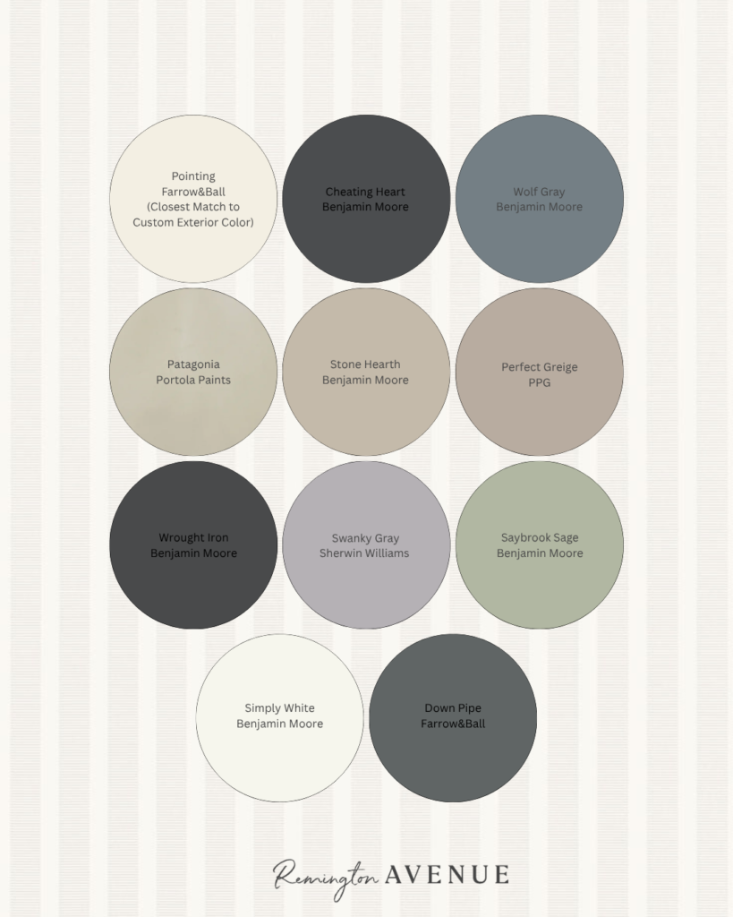
After even more testing and sampling, we landed on a custom color that is just perfect for us. It’s a warm, welcoming white that doesn’t pull too beige or creamy. Since it’s custom, it’s tricky to share an exact formula, but I’ve found that Pointing by Farrow & Ball is the closest match.
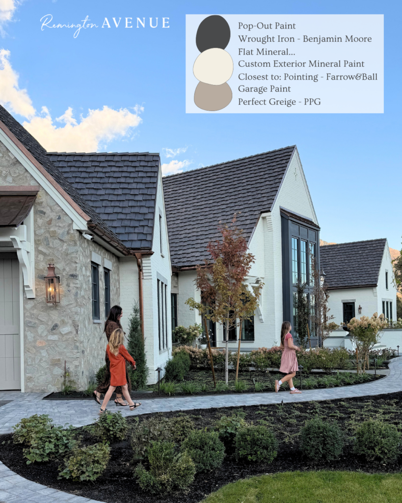
I shared more on exterior paint colors and picking the perfect shade for you, here.
From there, we added depth with two additional exterior paint colors. For the garage, we chose a warm neutral – “Perfect Greige” – that complements our stone and grout color. This helps the garage feel integrated rather than overpowering. On the front pop-out, we used a deep charcoal gray – “Wrought Iron” – to add dimension without going so dark that it feels heavy. We have 4 pop outs around my home all painted this moody dark color. I love it.
Inside, I’m still working through several rooms, so this list of ‘best paint colors and wallpaper ideas for every room in your home’ will continue to evolve.
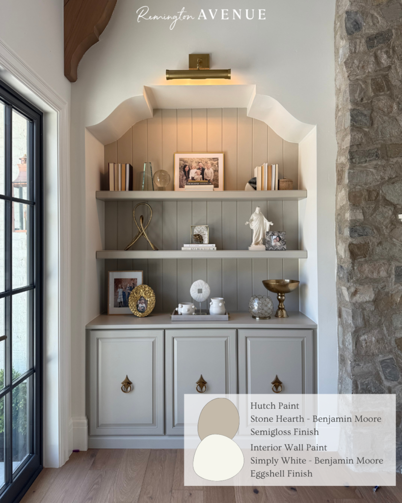
That said, I wanted a few consistent colors to carry throughout the home as a neutral foundation. On the main interior walls, the kitchen, living room, and hallways, I used a soft white from Benjamin Moore that I absolutely love. It responds beautifully to natural light and pairs seamlessly with the stone and marble finishes in these spaces.
To add subtle contrast, I used a deeper, earthy Benjamin Moore tone on the built-ins like the living room hutches and kitchen cabinetry. It’s still warm and neutral. But it gives just enough depth to keep things interesting without drawing too much attention.
Once we chose those, I could move into the more playful paint and details! The fun stuff! When selecting the best paint colors and wallpaper ideas for every room in your home, I like to match the base tone of the paint to the pattern.
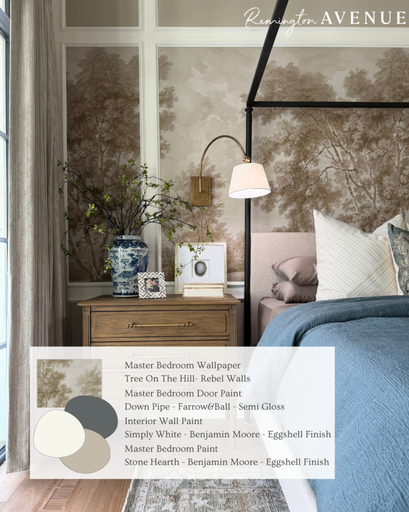
Starting with our bedroom, we fell in love with a mural that reflects the same warmth and natural feel as our exterior. We used “Stone Hearth” for our base color. I used our accent color in the frames of the molding surrounding the mural, and kept the remaining walls the same soft white used throughout the house for continuity. For a bit of contrast, I painted the doors in Down Pipe by Farrow & Ball. It adds character without competing with the mural. And it even ties in perfectly with our bedding. Its a fantastic blue gray color that feels rich and traditional.
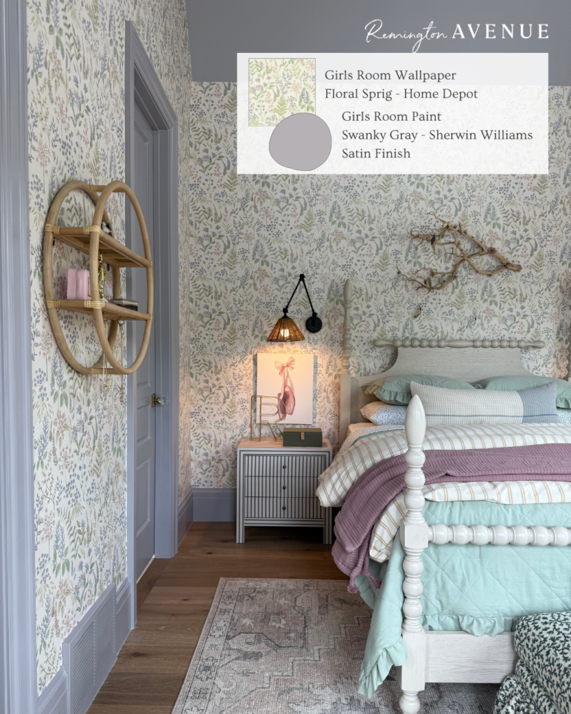
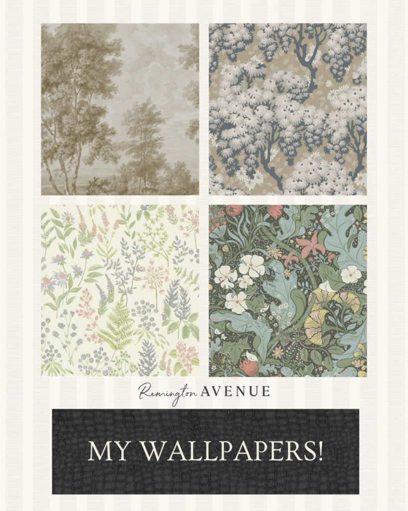
Next was Remi’s room! We wanted something feminine and fun that she could grow into. We started with a floral wallpaper. This gave us a lot of flexibility when choosing the wall color. Remi picked “Swanky Gray” by Sherwin-Williams which is the same color I used in her striped bathroom in the previous home. She is a bit sentimental, this one. Like I mentioned earlier, it reads completely differently in the room than it did in-store. Here, it pulls a soft purple tone that feels balanced- not too pastel, not too muted. I love how it turned out, and more importantly, so does Remi.
A room that is truly a huge hit (ironically, the smallest) in our home is the entryway. Some may say the entryway is the most important room in the home because it is most likely the first thing visitors see! I had a vision that took some real elbow grease to see through. I applied roman clay to the ceiling with a few layers to add color, texture, and dimension, and then sanded it down until my floor was covered in the dust!
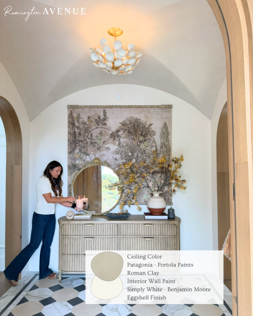
But it was so worth it. The vision really came to life and it is such a classy, gorgeous addition to this room. The walls are also “Simply White” by Benjamin Moore in an eggshell finish. And the roman clay is “Patagonia”.
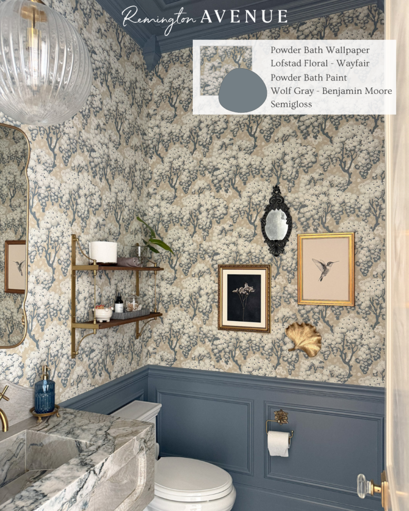
Another favorite project – the powder bath! I actually found the wallpaper months before starting the space and designed the room around it. The soft tree pattern creates the most magical, “Bridgerton”-inspired feel that always gets a fun reaction from guests. Originally, I was going to use the color Down Pipe from Farrow&Ball that I used on my bedroom door and in the mudroom. I absolutely love this color, but once I sampled it in the bathroom I realized it pulled super gray rather than the beautiful blue I was going for. It was a good example of just how much natural lighting can change the look of a swatch. So instead, I used “Wolf Gray” by Benjamin Moore and it gave me that blue hue I was looking for.
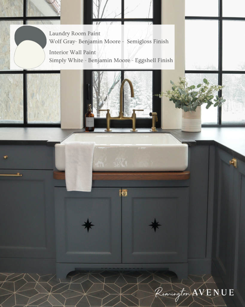
In the laundry room, we used that same “Wolf Gray” color on the cabinetry. While this room does have some natural lighting coming in from the windows, it is typically shaded from the shape of the house. So this color is still a beautiful muted blue. Since we chose a darker countertop, it was important that the cabinetry paint color didn’t feel too heavy. The walls are still the same Benjamin Moore white used throughout the home to keep everything feeling connected and clean.
Our stairway is also “Simply White” by Benjamin Moore. However we used a satin finish for this part of the house.
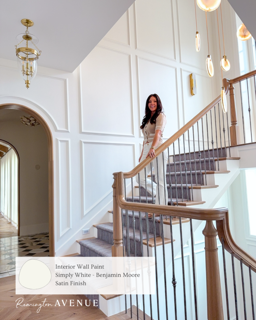
With the windows and the amount of trim, we wanted to use a satin finish. This adds some luster to the drama and beauty of the staircase! This truly helps bounce the natural light though the staircase and makes it easy to whip down.
One of my personal favorites, and definitely a bolder choice for me, is the theater room. I started with “Cheating Heart” by Benjamin Moore to create a moody, low-reflection space ideal for watching movies. Because the room opens to the game room and gets natural light, going darker was essential. We fully color-drenched the space. From the walls to the lighting cans and even the speaker covers to create a seamless, elevated feel.
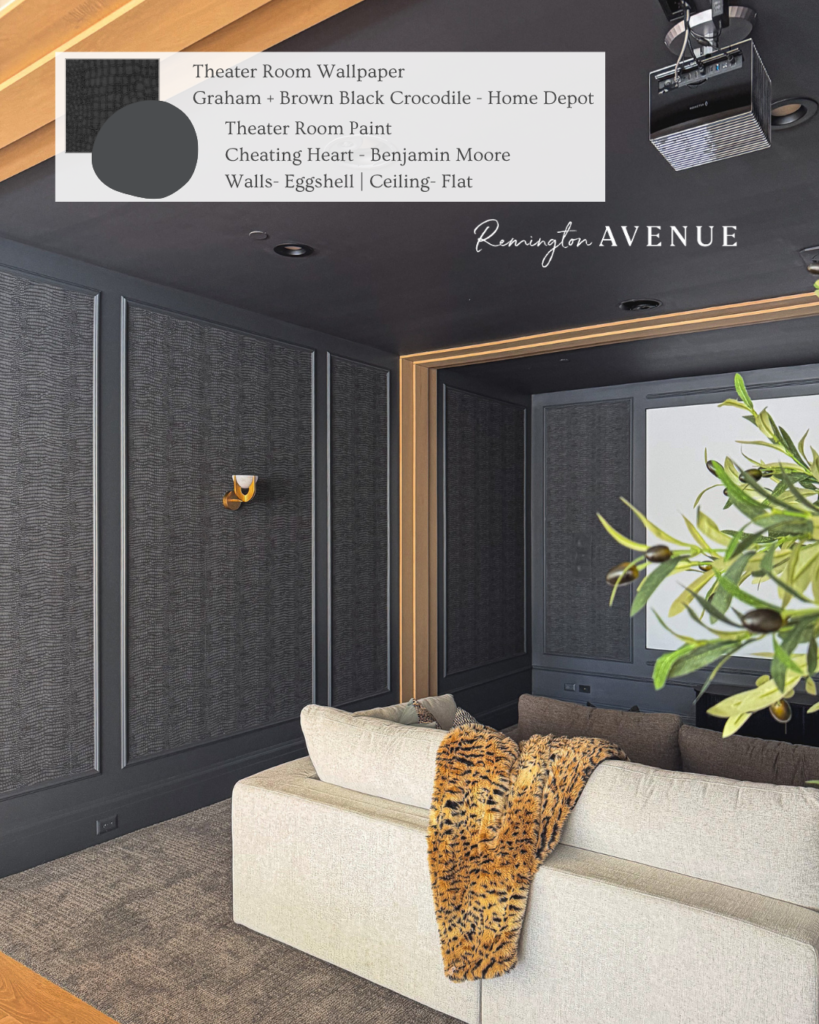
After considering several options, I chose a black crocodile print wallpaper from Home Depot. From a distance, it adds subtle texture, and up close, the detail is incredible. It really elevates the room. I added the wallpaper within the trim boxes as a callback to my bedroom. It’s important to keep cohesion throughout the entirety of the house, not just room by room. So even though the theater and my bedroom are completely different colors and vibes, they carry the same design and architectural details.
And finally, we’ve just started on Lou’s room! We wanted something playful, yet girly that reflects her personality.
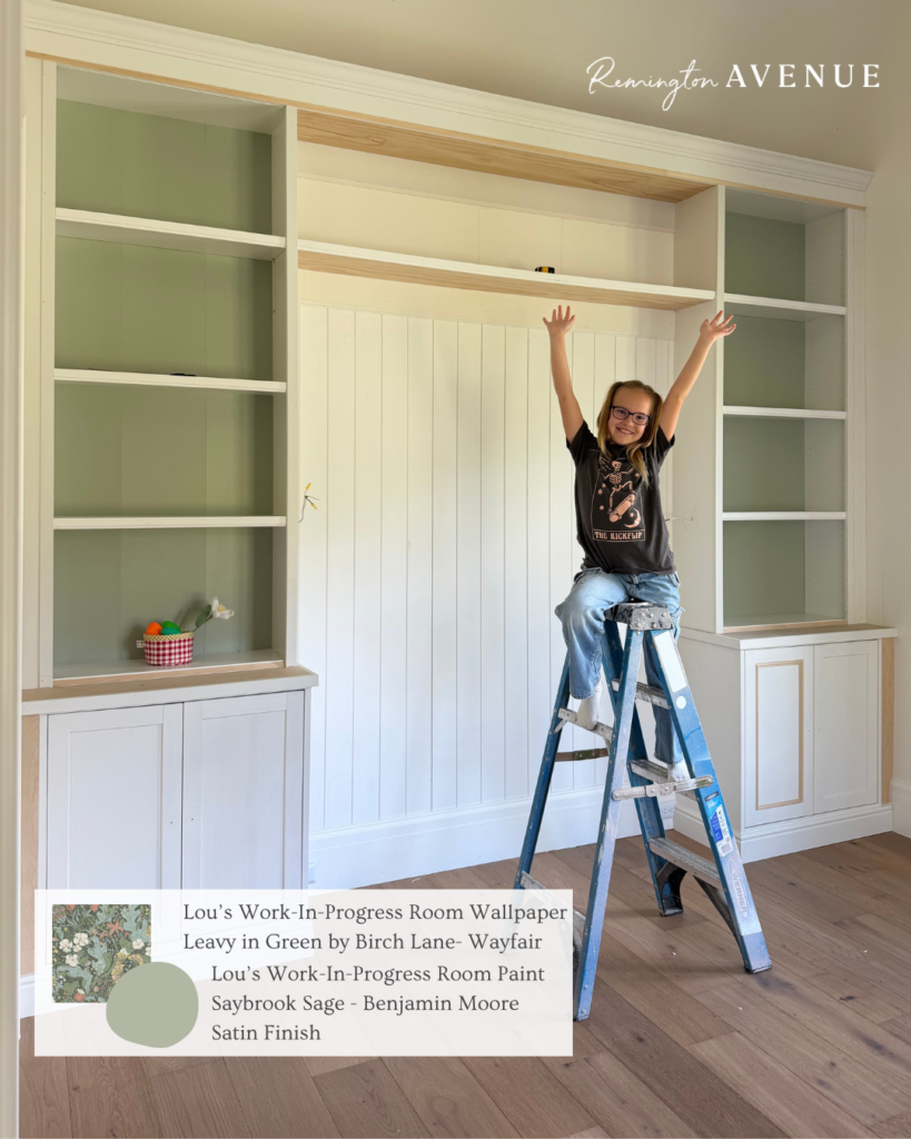
“Saybrook Sage” set the tone, and we paired it with a wallpaper that complements the green beautifully. This combination helps pull out the floral tones without making the room feel too dark.
At the end of the day, creating a home starts with how each room feels, and that begins with color. Furniture and decor can always change, but the foundation is on the walls. You can see I am using a lot of different colors, but the entire color story of the home works because the undertones are similar and complimentary. You can get creative, make it fun and stylish without feeling like it’s “too much”, trust me!
Shop My Favorite Paint Colors Here // Shop My Favorite Wallpapers Here
I will always love the power of paint and how choosing the best paint colors and wallpaper ideas for every room in your home, can make it truly YOU! What is your favorite?

 Add to favorites or read later